
Brand Creation
Logo Visual System
Enterprise technology powers some of the world's largest organizations, yet the publications covering it were often functional and visually conservative. ERP Today set out to bring a more ambitious editorial approach to the category.
The Challenge
The challenge was to create a media brand that felt credible, contemporary, and distinctive from its very first issue.
The Work
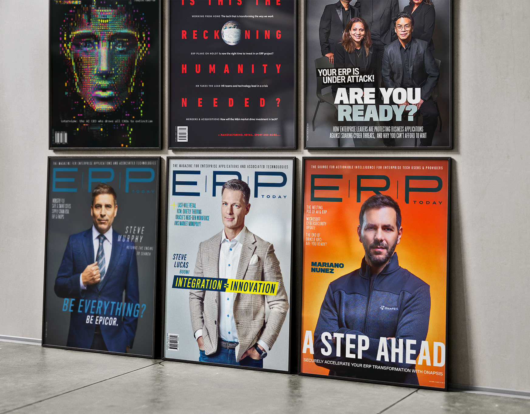
Editorial authority became the design strategy. A bold typographic identity and flexible editorial system established a publication that looked mature from day one and scaled seamlessly across 26 issues, digital publishing and industry awards.
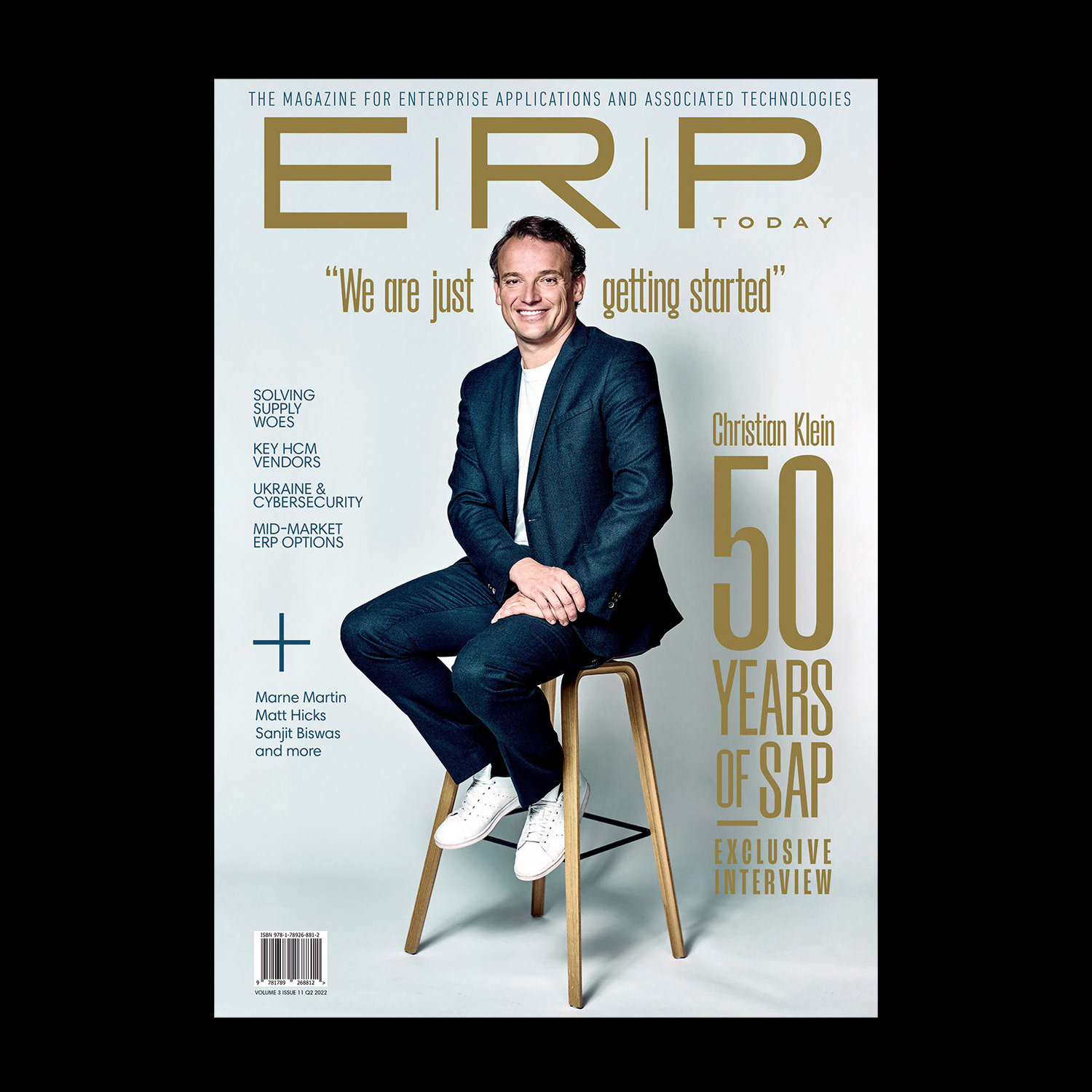
The cover, proof of concept
From Issue 1, the strategy was unambiguous: put the most powerful people in enterprise technology on the cover, shoot them like the industry's rockstars they are, and let the design frame their authority.
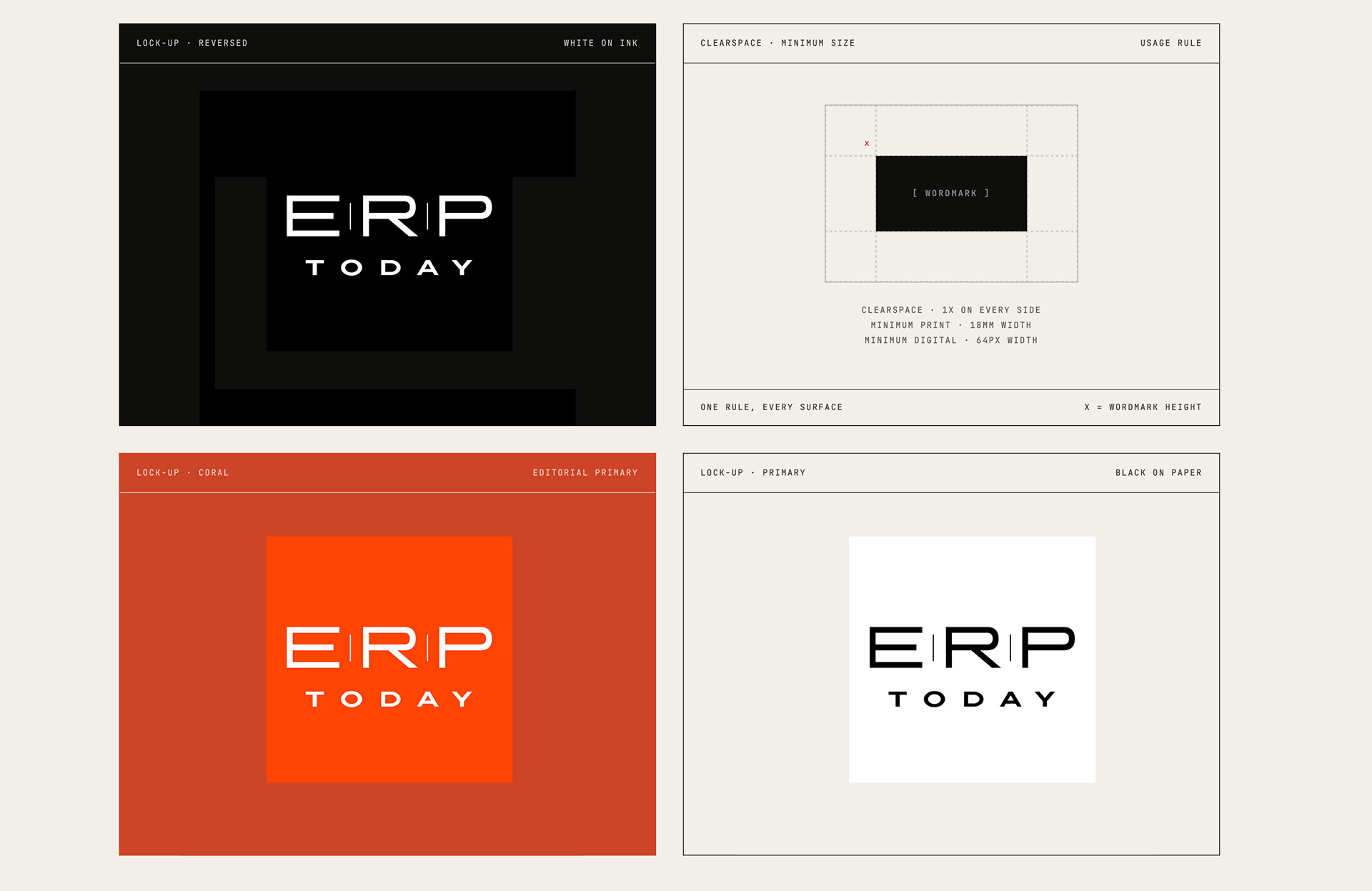
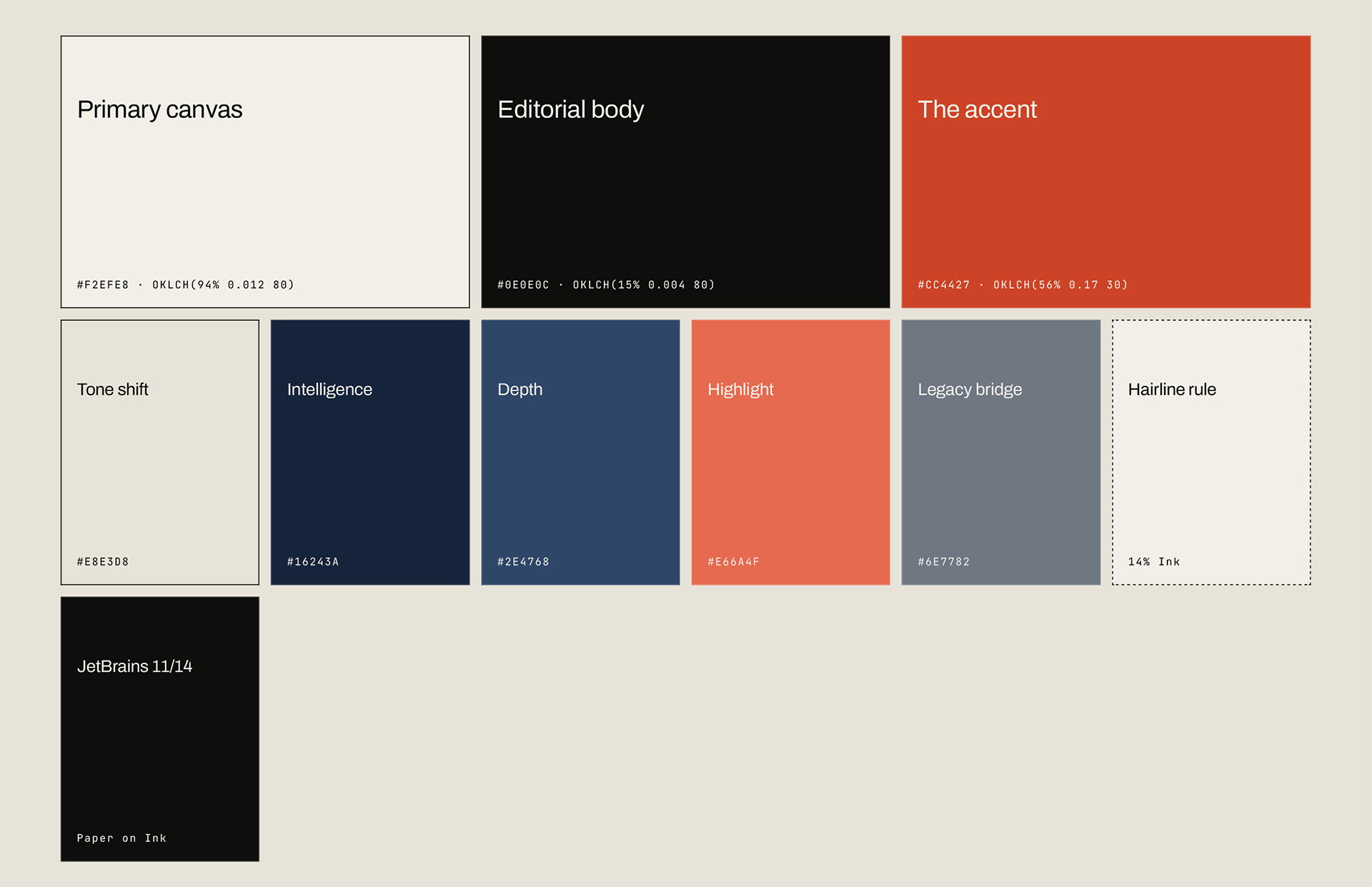
A brand built from nothing that looked established from its first issue. The palette is restrained, journalistic. It reads like paper, not screen. No gradients, no tech-blue, no iridescence. While every competitor was chasing the aesthetic of enterprise software, ERP Today looked like a magazine that had been on newsstands for decades.
The ERP Today Platform
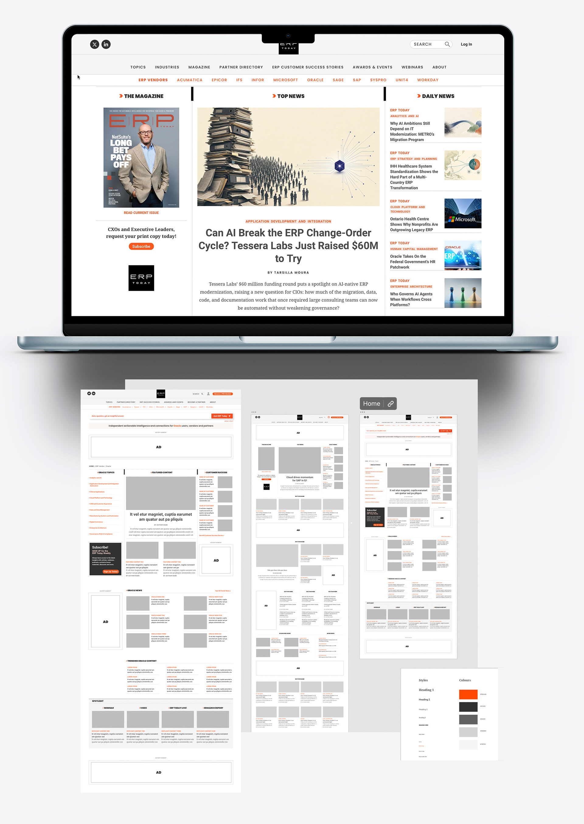
The website extends the same visual logic as print, structured as a news portal with editorial weight. Clean hierarchy, typographic discipline and a restrained color system signal authority. The architecture separates news, analysis and magazine content clearly. Images from the print edition carry into the digital environment, maintaining continuity between formats.
A System that Scales
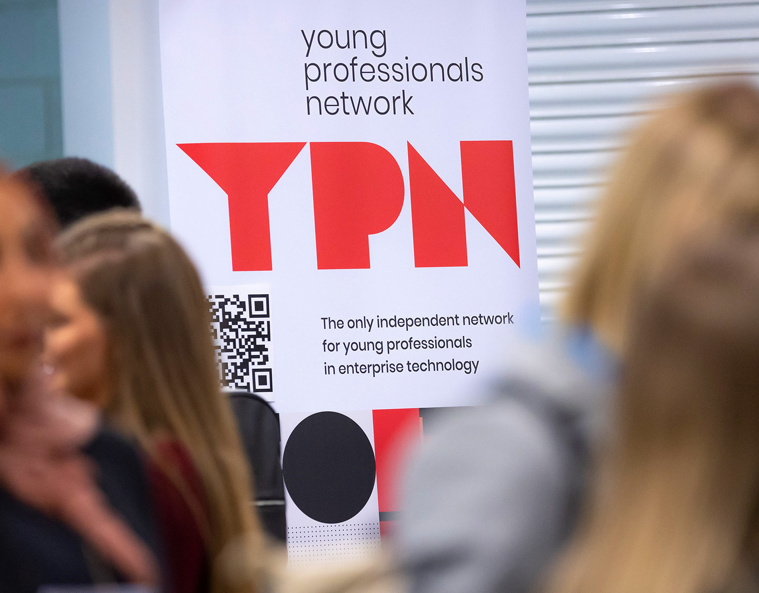
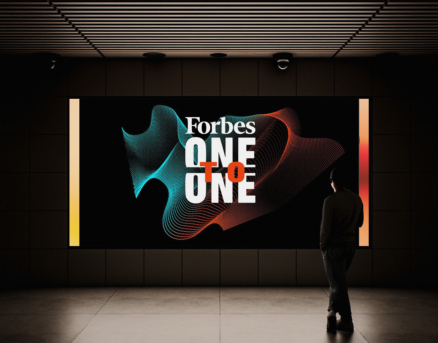
ERP Today Live!, ERP Today TV, The ERP Today Awards and the Young Professionals Network each operate as distinct properties, with their own audiences and formats, but all draw from the same visual DNA. Each sub-brand reads as its own thing and as part of the same family at the same time.