Overview
SAPinsider is a global media platform for enterprise technology professionals, producing in-depth editorial content across print and digital formats.
Challenge
Present complex, technical content in a way that is clear, consistent, and easy to navigate across different types of articles.
Role
Led the design of the publication, focusing on content structure, layout systems, and visual consistency.
Approach
I approached the project as a content system rather than a series of individual layouts.
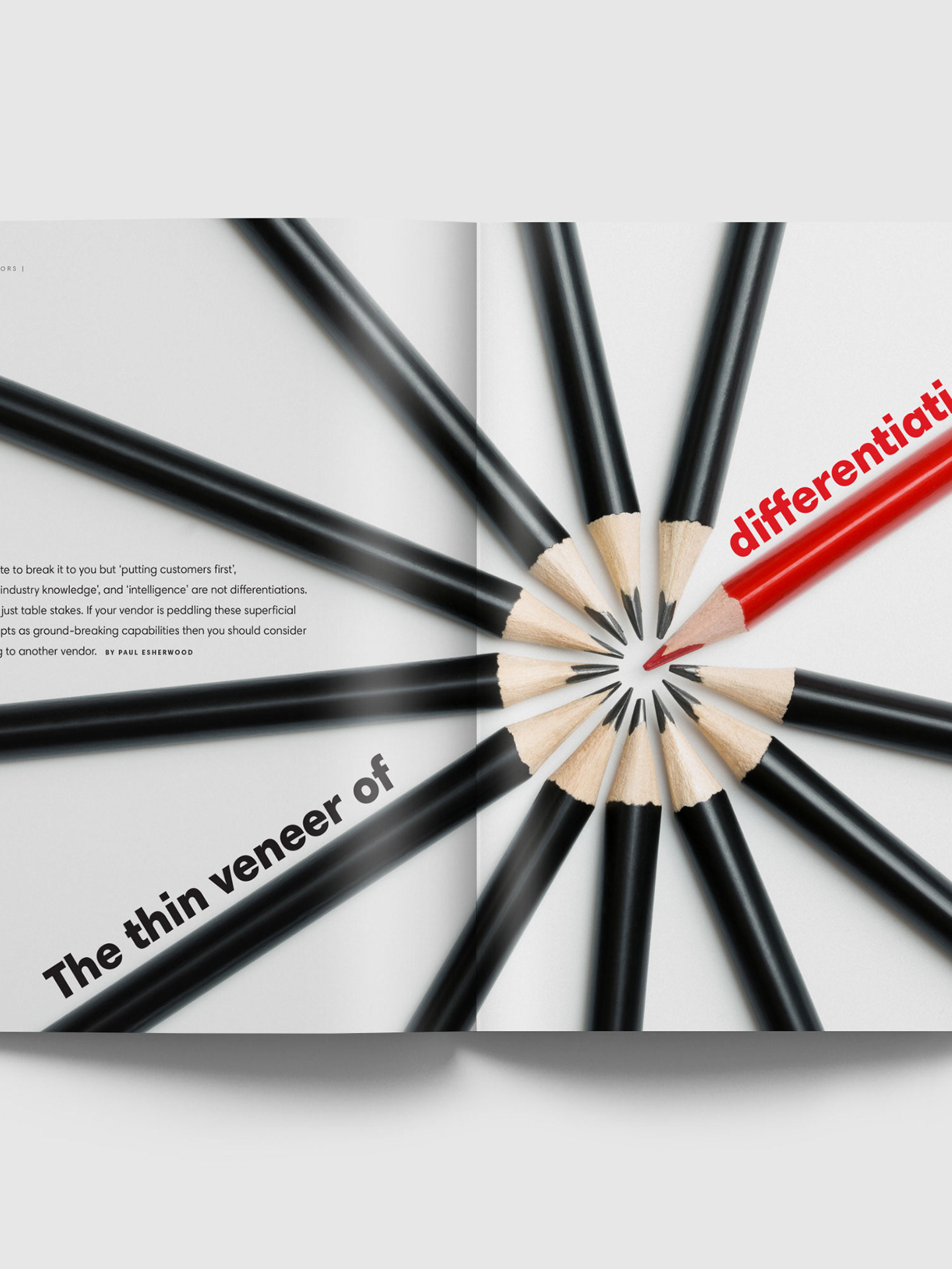
Content structure & hierarchy. I developed a clear typographic hierarchy to organize complex information, helping readers quickly identify key sections, headings, and supporting content.
Layout system. I created flexible grid-based layouts that could accommodate a wide range of content types—from long-form articles to data-heavy sections—while maintaining consistency.
Templates & scalability. I designed reusable templates to ensure efficiency and coherence across issues, enabling the publication to scale while preserving a unified visual language.
Readability & flow. Special attention was given to spacing, rhythm, and visual balance to improve readability and guide the reader through long-form content.
Outcome
The result was a cohesive and scalable editorial system that:
> Improved clarity and readability of complex technical content
> Provided consistency across the publication
> Supported efficient production workflows
The system helped transform dense information into a more accessible and structured reading experience for a global professional audience.
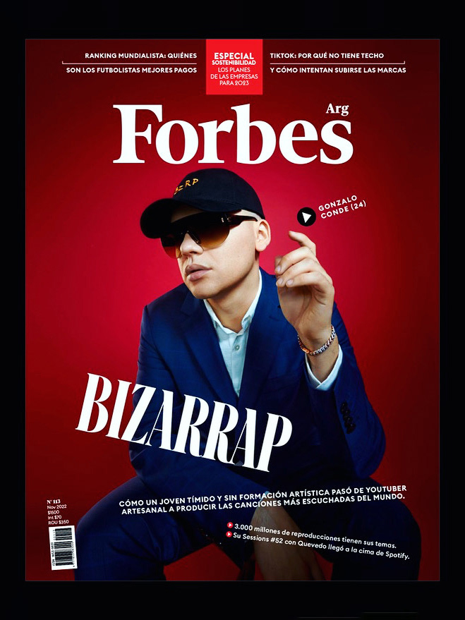
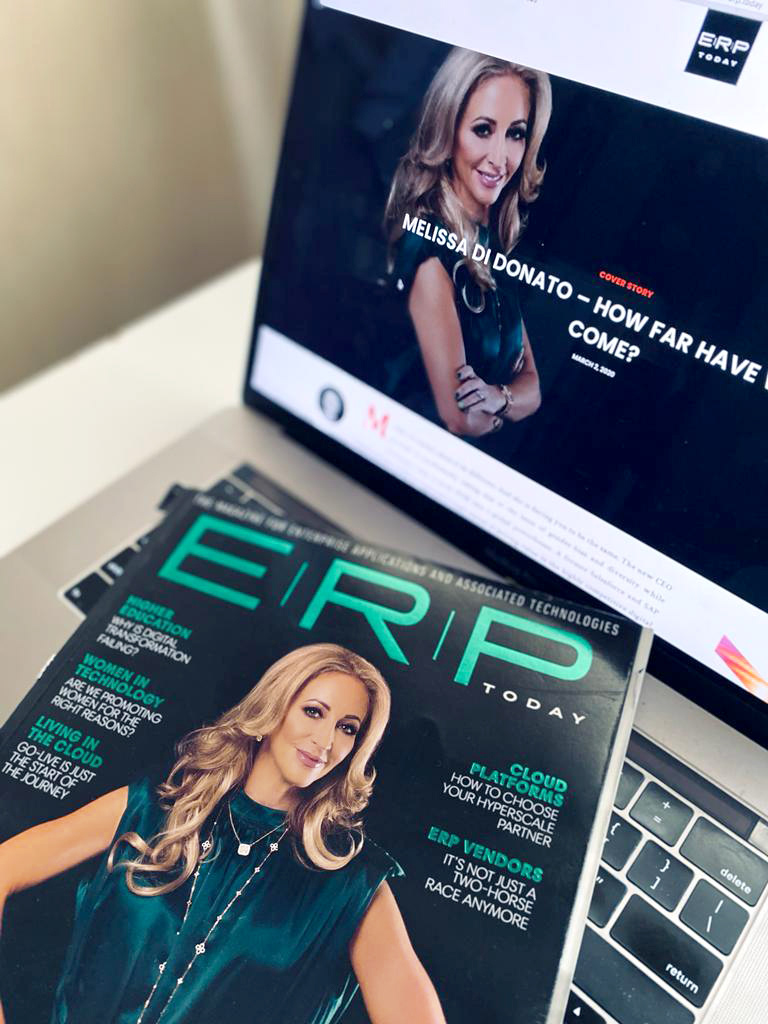
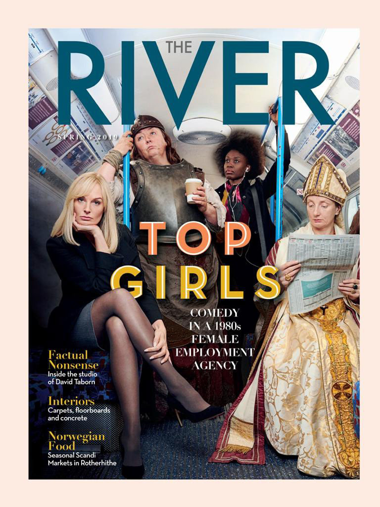
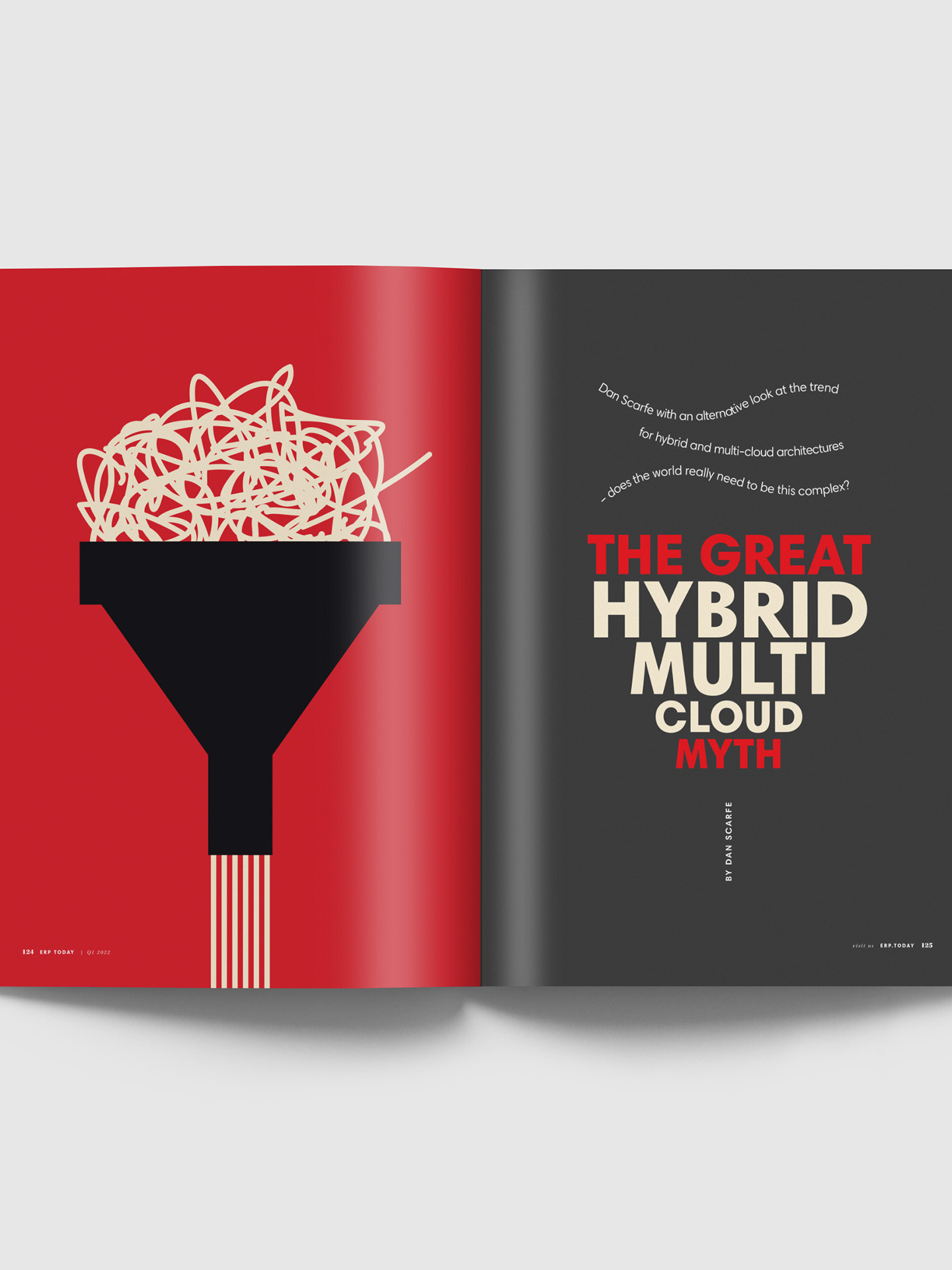
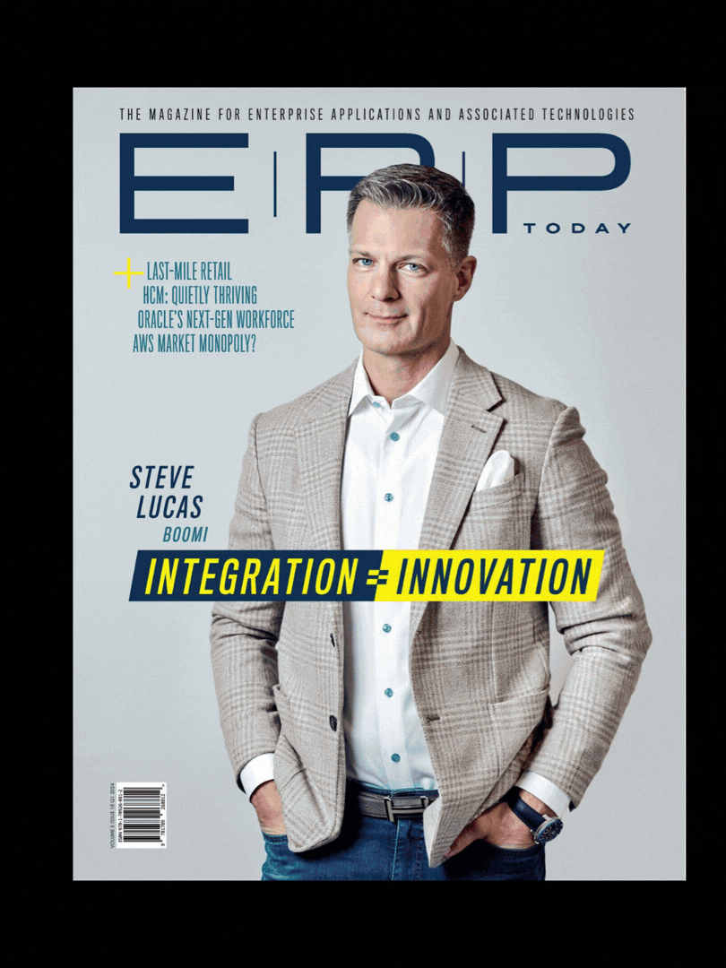
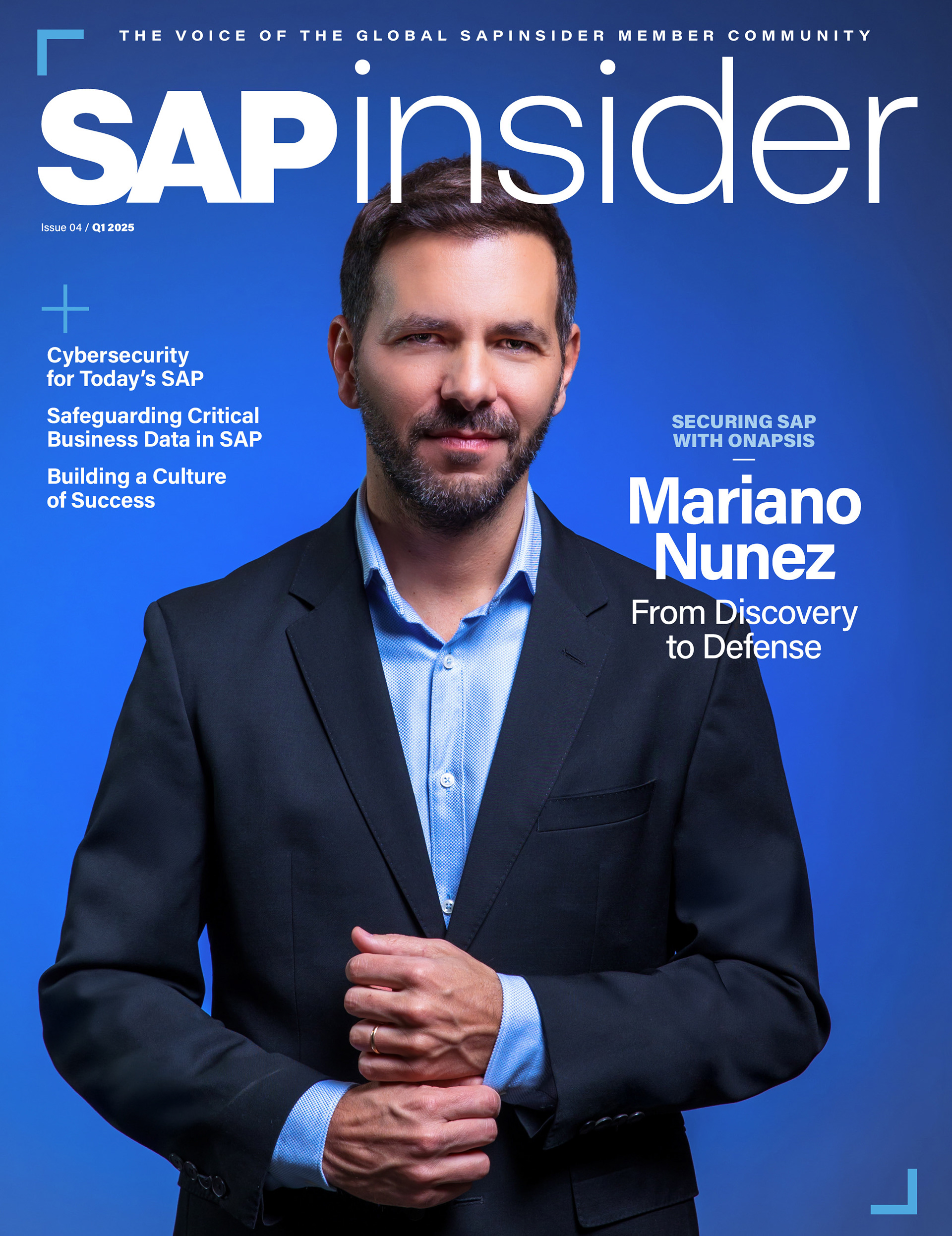
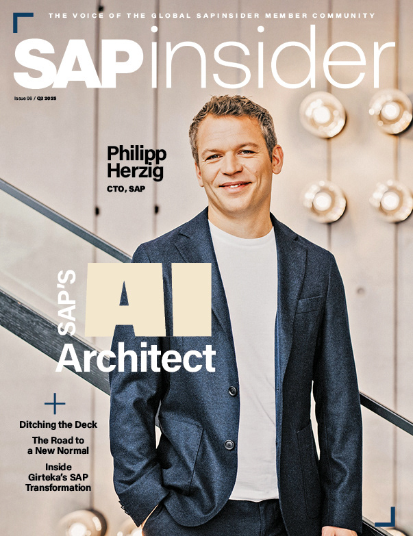
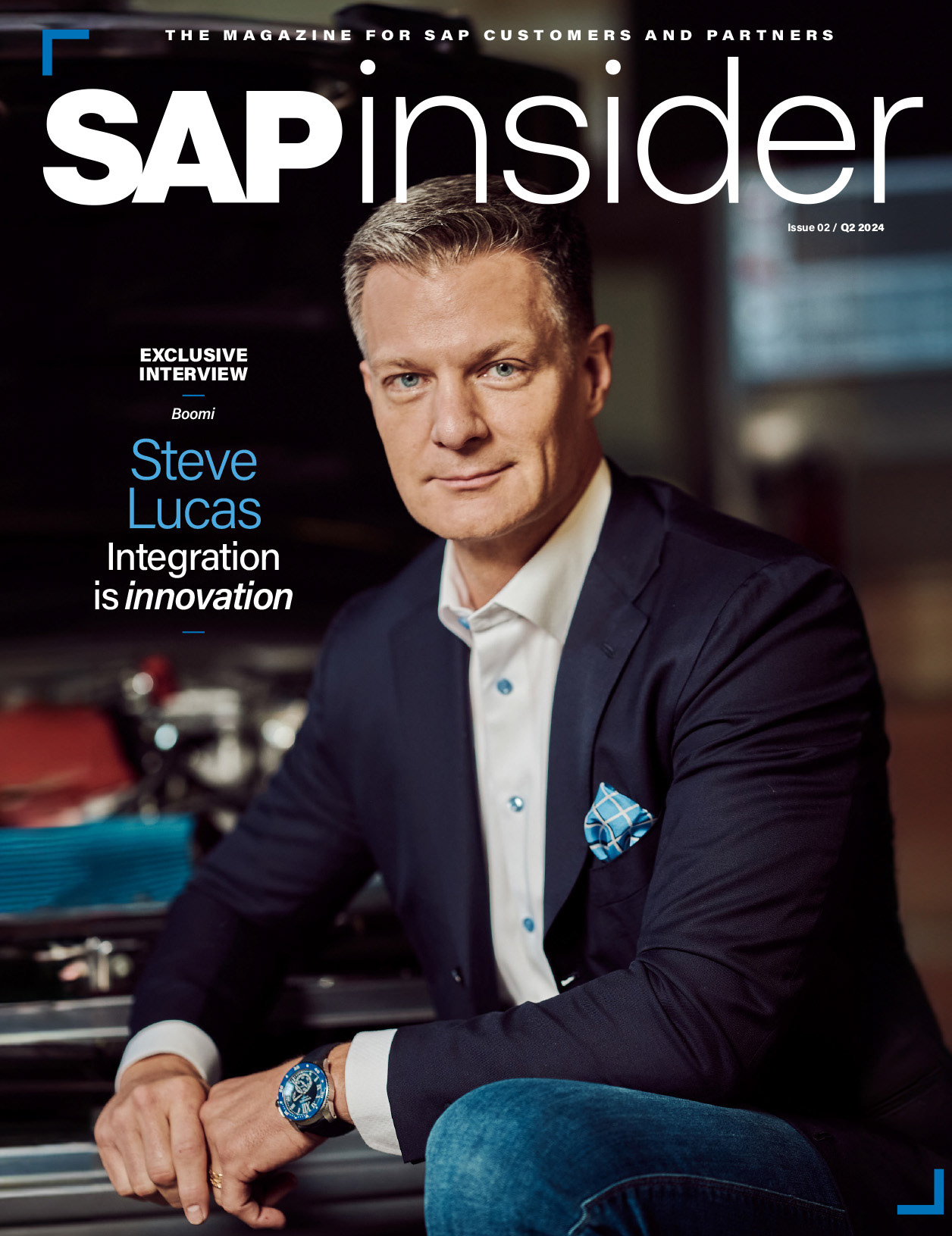
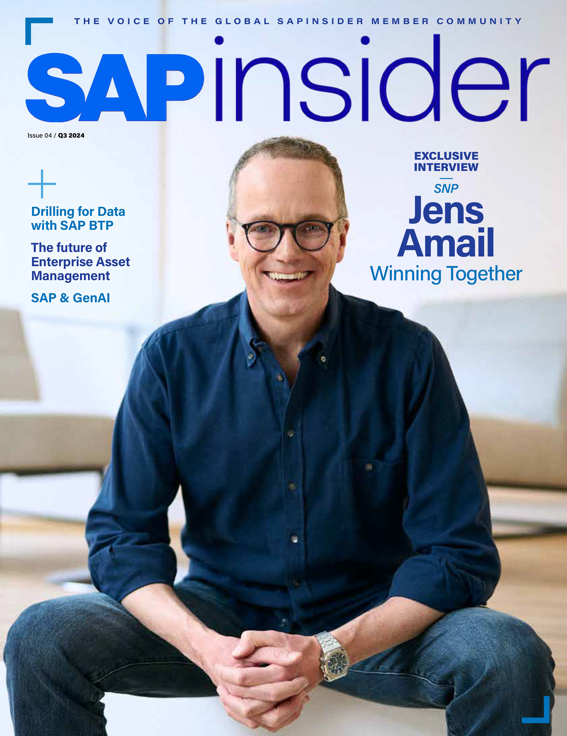
Magazine Layouts
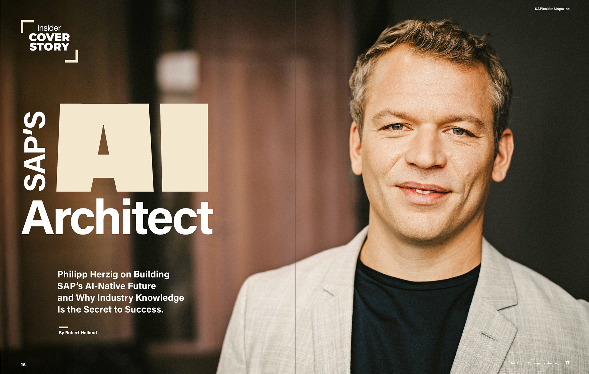

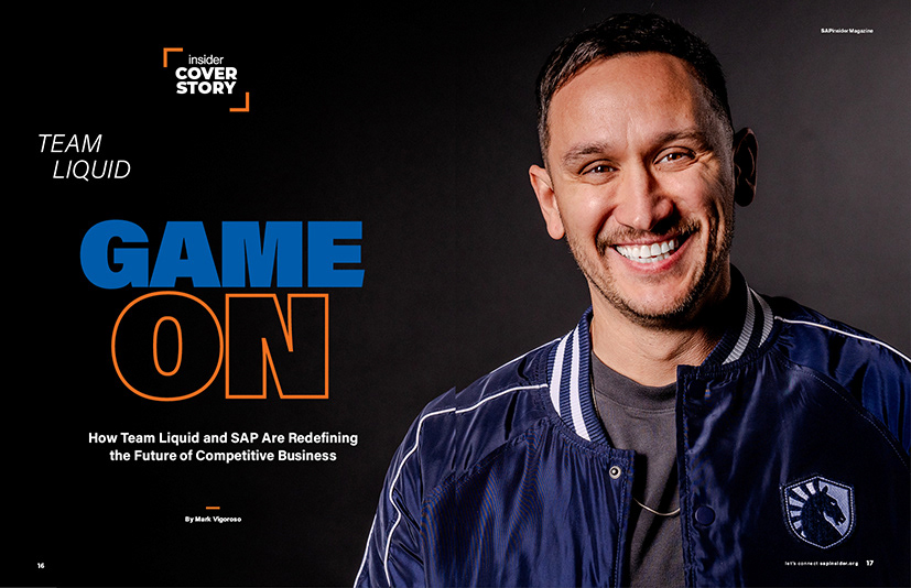
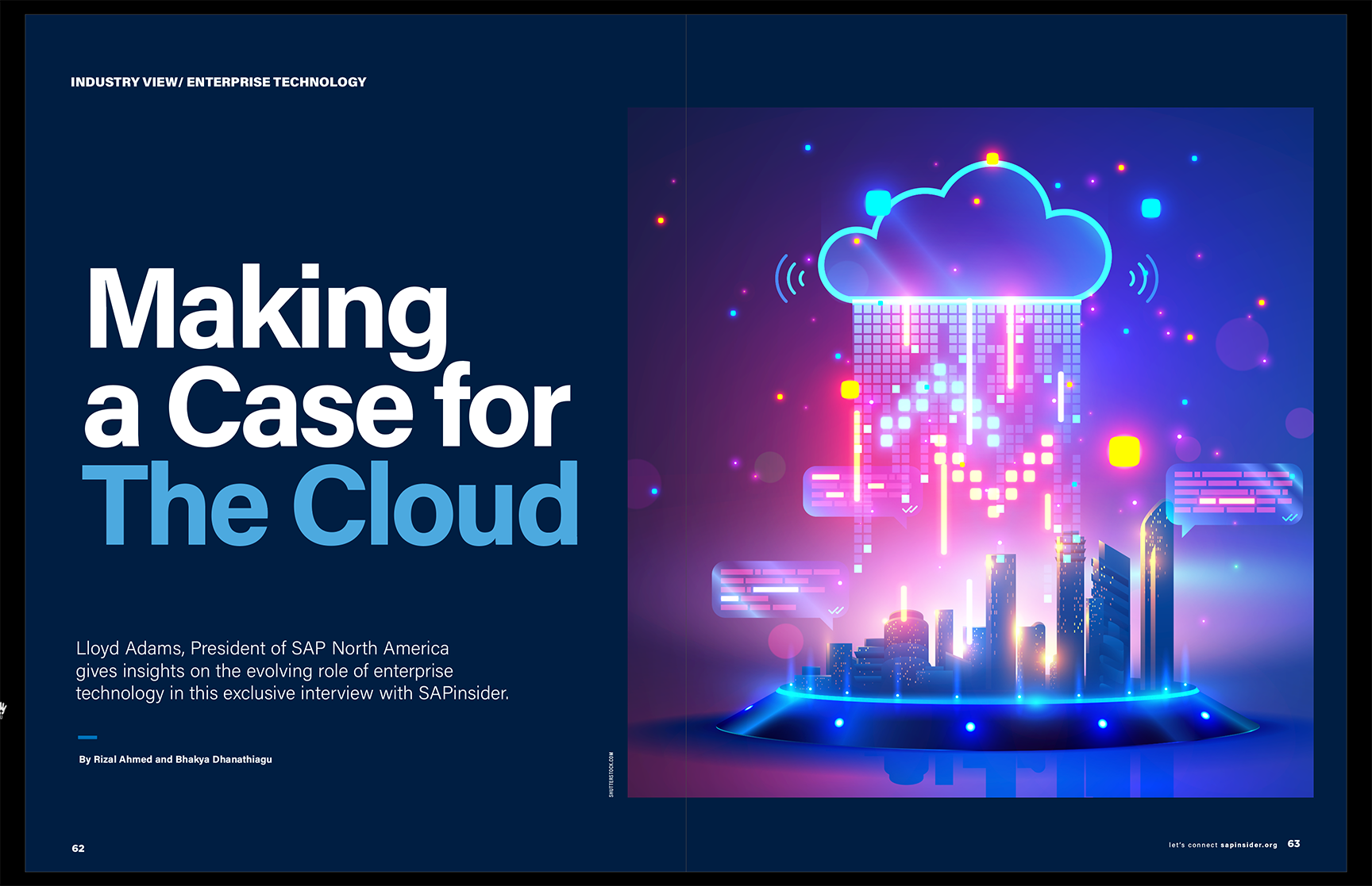
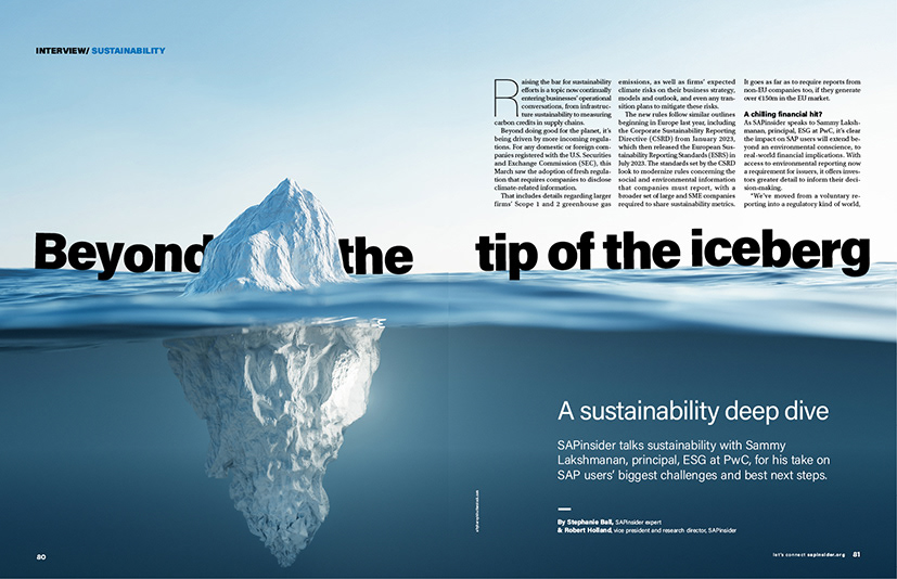
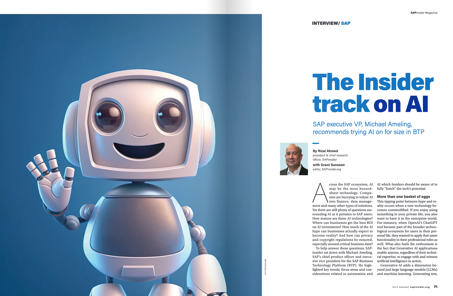
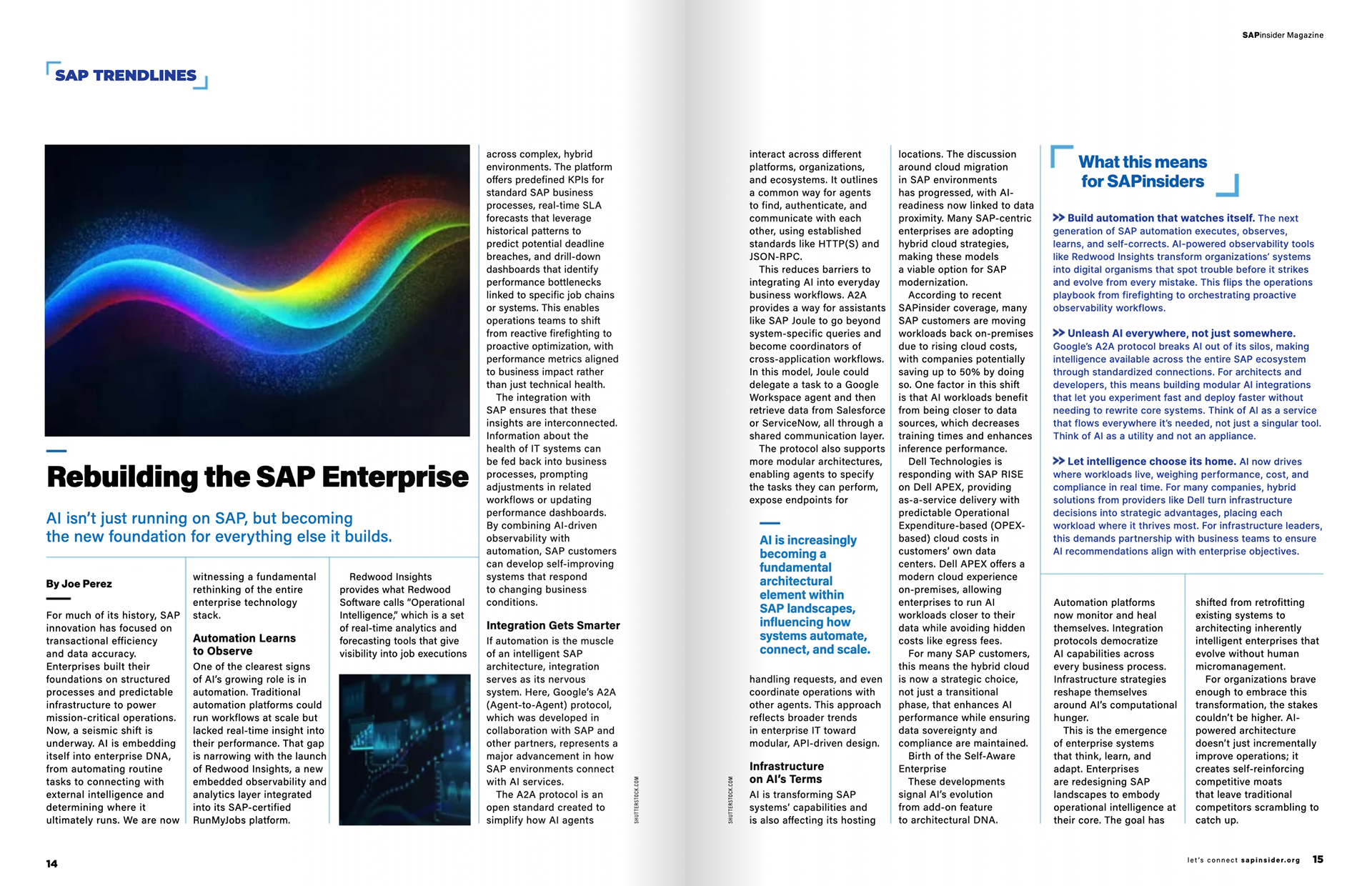
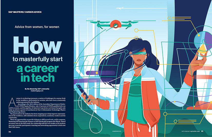
Through strong typography, modular layouts, and conceptual imagery, the design turns complex SAP technologies into clear, engaging, and human-centered stories.
I approached the design of the magazine as an editorial storytelling platform rather than a technical publication. The design treats SAP topics—digital transformation, AI, SAP BTP, cybersecurity—as narratives that unfold through hierarchy, pacing, and visual rhythm.
White space, scale, and typographic contrast guide the reader through dense material, making complexity feel clear and readable.
The result is a magazine that respects its audience’s intelligence while making enterprise technology more engaging, human, and enjoyable to read.
Design executed while serving as Chief Design Officer, Wellesley Global. © Wellesley Global.